Why Vente?
In today’s information-saturated world, we are flooded by all sorts of shows, meetups and other events. Despite this, we still have trouble finding activities that best align with our interests. Vente is an app that offers personalized recommendations so that people can easily find what to do in their local scene.
Challenge
Create a visual design system for Vente, including a logo, high-fidelity screens, an interactive prototype, and a responsive marketing website. Previous artifacts were: user personas + initial UX wireframes.
Personas
Research
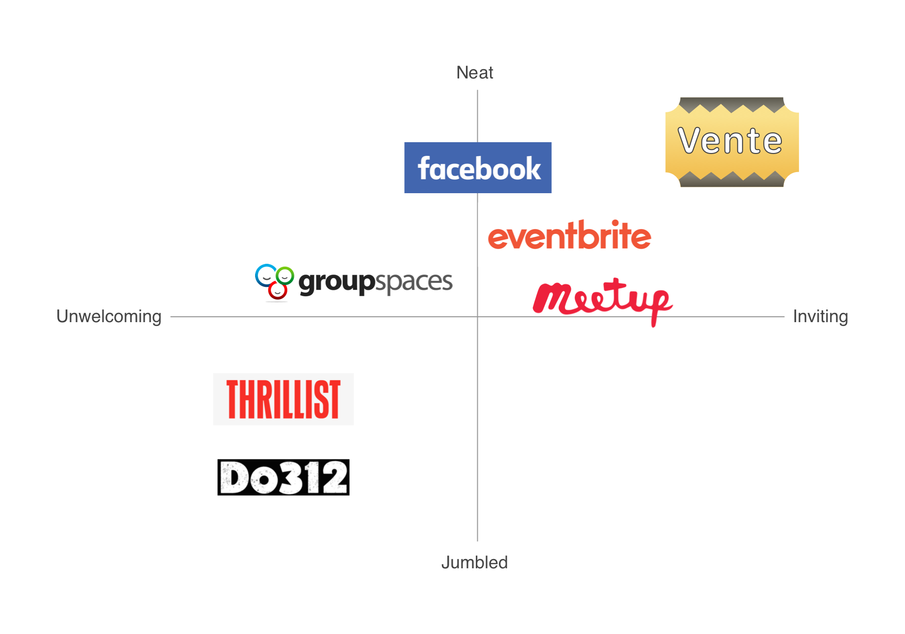
In creating an affinity map for the visual competitive analysis, I identified some patterns: bold, vibrant colors, lots of categories, and various ways to sort through events or meetups (by date, location, price, distance, interests, editor’s picks and so on).
I was surprised to find that two major competitors’ websites showed their categories in a way that collided with the rest of the visuals. A problem was that those ended up looking dense and overwhelming with such highly saturated colors.
I saw that there was an opportunity for Vente to differentiate itself by being more consistent visually and neat, as well as providing an easy and pleasing way to find relevant events.
Logo Exploration
To reflect friendliness and cheerfulness, I came up with a few representative visuals: people going places together, a person on a hammock, an overjoyed mascot with its arms up. The concepts of being up to date, informed or connected were expressed by a trumpet and a power plug. The ticket was a concept to give a very clear indication of being able to get tickets via the app.
After further feedback from the creative directors, I choose the ticket concept for its instant recognition, and because it rendered better a different sizes.
Final Logo
Moodboards
Through a revision process, I became aware of a possible weakness in my composites. Although striving to create gender neutral experiences, and given that one of our personas was a male, I had failed to include photography of men in my moodboards. Fortunately, I could easily rectify this moving forward!
Style Tiles
Peer feedback was valuable as it made me realize that the bright yellow used in the first moodboard was too harsh on the eyes.
I tweaked the color to a more mustard tonality and it turned out that this composite was the preferred one to move forward with.
Wireframe Evaluation
After meeting with our creative directors and discussing the main concerns regarding the initial wireframes, our team came to the conclusion that although there were no major issues preventing first time users to sign up, there were still ways to make navigation smoother, less confusing, and more delightful.
High Fidelity Designs
Our team had agreed that the bottom navigation iconography wasn’t obvious enough, so I changed the alert icon from a ray to a bell. The bell would now represent notifications and messages. The “Events” icon, which initially was a circle of people, turned to a calendar indicating events – past, saved and upcoming ones.
The user profile section gathered information about the user’s groups and interests which could be edited at any point, and a settings icon was now nested in the user profile area as well.
Whilst before there wasn’t much difference between the content in the homepage and the search page, now the search icon represented “Explore” and the user could also find events by location, using Google maps.
Challenging aspects of the app became more defined as I strived to solve through the eyes of a user. I also did more research and learned how competitors solved specific issues that I had encountered while designing for Vente.
Responsive Marketing Site
One piece of feedback that I got from my team, which was very pertinent, was thinking about diversity. My previous iteration had two hands holding phones and both of them were white. Most hands that I had found online were white when typing “hands holding phone.” But to incorporate hands that are representative of various skin colors, one has to intently type “diverse hands.” It’s essential that us designers depict diversity, even if it’s going out of our way.
User Testing and Final Thoughts
Users’ insights were extremely valuable and helped me view the product in ways that I hadn’t considered. I wanted to sync Meetups with Vente during onboarding with just one click. However, some users expected to enter their login information in the other app first, which made sense if they weren’t already logged in.
As the makers of the experience, we find it obvious to concentrate in certain parts of the screen, then move to other parts – left to right, top to bottom for instance – However, users’ eyes focused differently on the screen. It can be tricky to relativize these disparate responses. More user testing can help us with those.
Given what I learned with user testing, with more time, I would have interviewed more people so to find common problems and fine tune for a more intuitive and streamlined experience.


