Client: Twindow
Role: Interaction Design, Visual Design, Usability Testing, Prototyping
Timeframe: Five Weeks
Tools: Sketch, Invision, Principle
About Twindow
Twindow is a drive-thru convenience store combined with a digital platform that enables shoppers to select staple items through a mobile app and pick the order at a nearest Twindow, anytime of the day and without having to deal with lines, for a fast and seamless shopping experience.
Problem Statement
Our team was assigned to evaluate the existing UX artifacts – mid-fidelity wireframes and persona – to create a visual language for Twindow, including logo design, microinteractions, and a responsive marketing website, aligning user research insights with the client’s goals.
Wireframe Evaluation
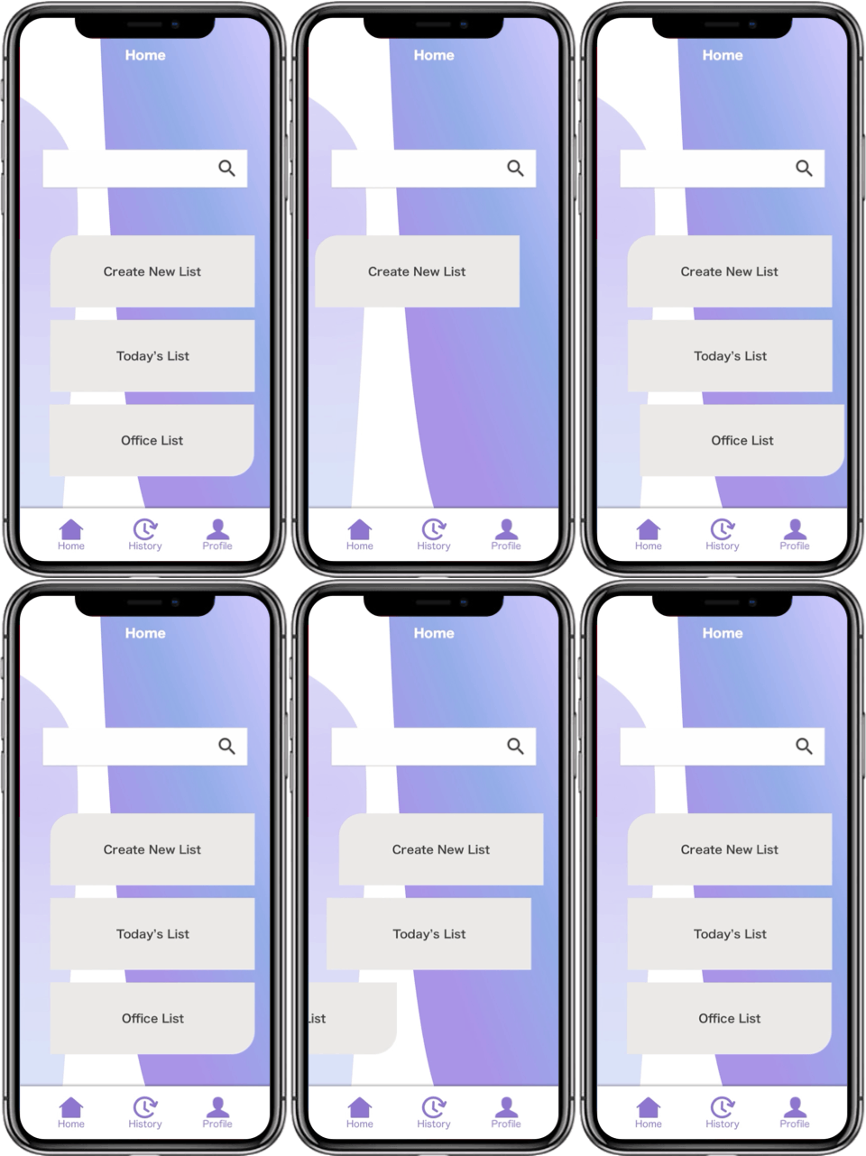
At first, we found the wireframes to be somewhat unclear. The home screen “Explore” did not include any images of products. Instead, it had a search bar and large buttons that corresponded to lists that a shopper was expected to create. Secondly, labeling was unconventional. Lists were labelled “orders” and the well-known “add to cart” was “add to order.” Thirdly, the “Set Pickup” screens which included the key feature of choosing who would be picking up items were unclear. Several icons on the map indicated different things and felt confusing. Our team was eager to simplify these screens.
KEY INITIAL UX WIREFRAMES
First, we decided that it was best to meet with the client to discuss the business goals, as well as hear from the UX team that had come up with the initial wireframes.
After meeting with Twindow’s founder and CEO, we found that the goal was for the app to be as easiest and straightforward as possible. His vision was to only provide curated, staple items and users would ideally open the app and be able to create an order immediately.
In discussing wireframes with the previous UX team, we found that the reason why there weren’t any browsing for products was that the experience would be tailored for users who knew, specifically, what they were looking for, hence the search bar being a key feature in the app.
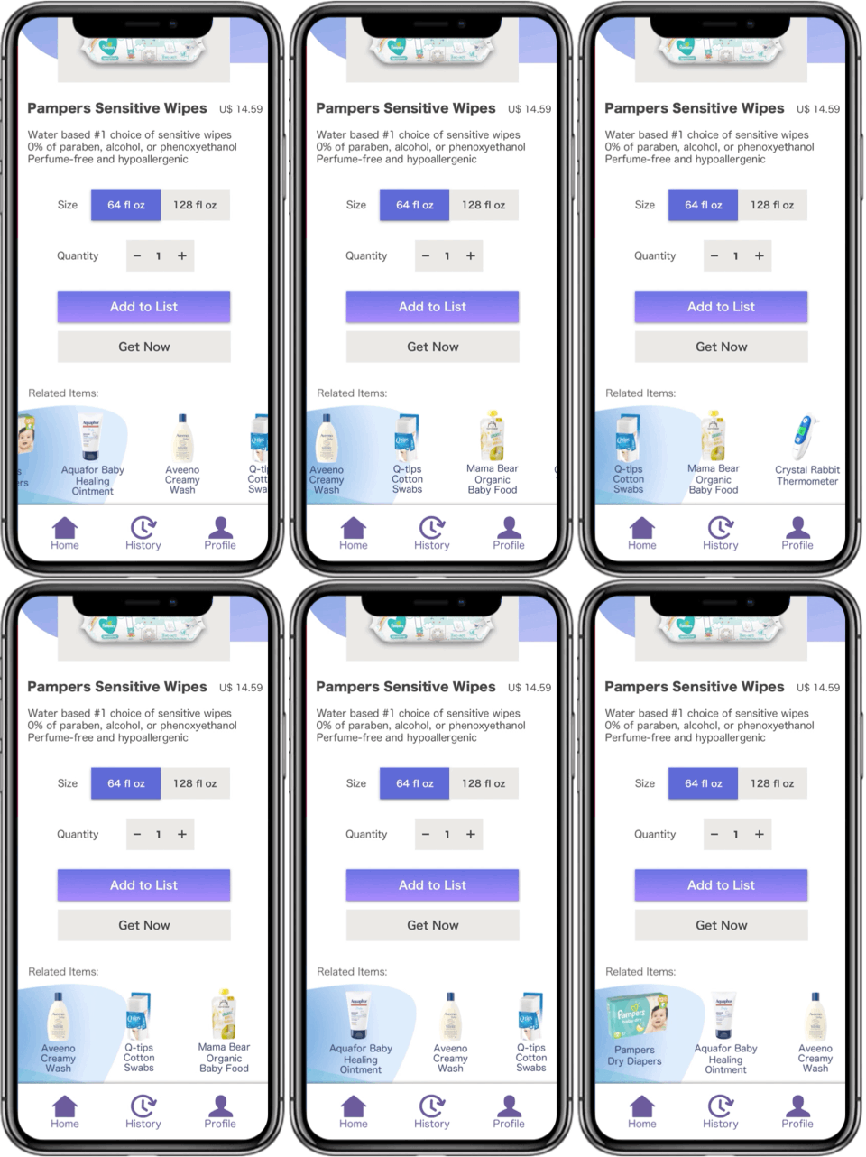
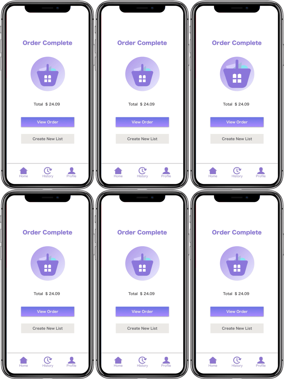
Revised wireframes: changes in labelling and a more straightforward approach to adding items to a list.
In regard to the “Set Pickup” screen, we thought that with smaller tweaks the concept could actually work well once users learned it. User testing would help validate previous decisions, as well as give insight to craft a more usable and good-looking interface for the app. Anyhow, this was indeed a different approach to shopping (reserving orders) and getting your items (drive-thru pickup).
Visual Competitive Analysis
Our team analyzed seven direct and two indirect competitors. Here are some of them and our findings:
Less was more. The easiest apps to navigate were more minimal and clean (less icons, more white space)
The most enjoyable experiences had friendly details (unobtrusive, useful microinteractions and fun icons)
Inconsistent elements across digital platforms reduced brand effectiveness (different logo styling, for example)
User Persona
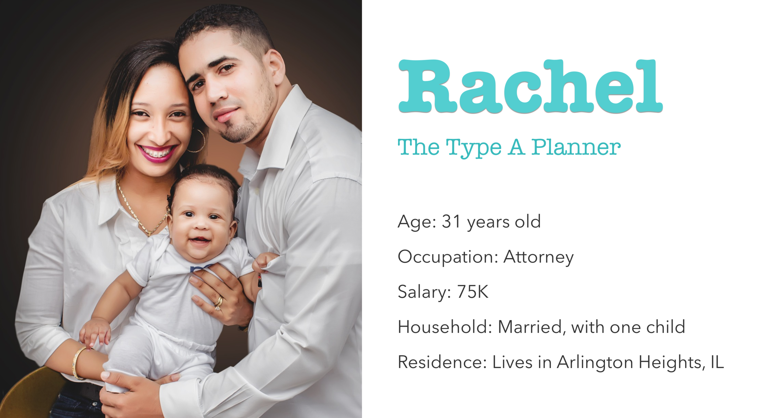
From the previous UX team we inherited the persona Rachel. A busy, suburban working mother, she finds it hard to go shopping with her children. Her goals are to be able to get grocery items quickly, and to easily communicate with her husband about last minute purchases, so they can enjoy more family time.
Design Principles
After performing the visual research and understanding the persona, our team aligned to create design principles that would guide our designs going forward: Essential, Personal, Memorable.
Design Explorations
Focusing on Rachel, a busy working mom, I strove to make layouts easy to sort through visually, while injecting an optimistic, vibrant feel in all three divergent moodboards.
FRESH AND VIBRANT
The client had expressed a preference for blue so I applied it in this first style to see what users felt.
MODERN
I was interested to see if a mid-century modern look would appeal to users as the style has gotten back into vogue in recent years.
PURPLE TONES
This was my take on memorability, given that purple is not common amongst the competition, and also to challenge myself as a designer.
The style explorations tested well overall and users found all three concepts “easy to see” and “clean.” The first style was considered neutral and somewhat boring to the participants tested. The second style was too stark for them. Users were clearly drawn to the third, purple design as it felt more “friendly,” “approachable” and “nice”. I had concerns with this composite being a little young looking, however, I knew I could tweak colors and generate mockups that felt more modern going forward.
THE CHOSEN STYLE
TwinDow or Twindow?
The client had expressed his preference for the capitonym “TwinDow,” though the spelling seemed to change the meaning of the word (he wanted it to allude to “window” and “two windows”). A quick A/B testing came in handy. To all participants surveyed, the capitalization of the D read “dow,” the verb “to be able or capable.” We suggested “Twindow” in place of “TwinDow.”
Logo Design
After meeting with the creative directors and getting peer feedback, amongst my logo explorations, a window merged with a shopping basket was the concept that best aligned with the brand.
Mockups
Our team’s high fidelity screens for Twindow
Prototype Testing
The overall feedback received on different rounds of testing was that my screens were pretty straightforward and clean-looking. Users described them as “easy to understand” as well as “pleasing.”
However, the ““Set Pickup” feature was still confusing to users due to the amount of icons and confusions as to what they meant. Furthermore, some participants felt that certain terminology was still unclear and wanted to see more commonly used words such as “add to cart” or “shopping basket.”
From this, we knew that more iterations could be made to address usability and further testing would help warrant better solutions.
Final Considerations
Innovative apps can be tricky as users need to learn concepts that they are not familiar with. Given more time, we would have liked to have iterated more on complex screens, or created onboarding to help first time users navigate. We also suggested that the client consider expanding the target audience in the future, including younger, busy city dwellers that could benefit from a walk-up store in addition to the drive-thru.
After our final presentation, the client affirmed how valuable it was for him to learn about users and all things that could be taken into consideration in developing such innovative product. We are eager to hear about the his next steps for Twindow.


